Ecommerce PDP Improvements


Seventeen’s product pages provided the essentials, with little context. Products were presented in a catalogue-style format, with limited imagery, and few cues to help users understand how products look, their benefits, or fit into their routine.
This project focused on enriching category pages and PDPs to transform static listings into more expressive, intuitive, and confidence-building shopping experiences.
Timeline
Over the course of 4 months, I implemented content, visual, and navigation enhancements, including strategy definition, asset planning, content creation, and phased rollout.
Process
Rather than redesigning isolated pages, I approached this as a systemic upgrade across the browsing and product experience.
I audited category pages, PDPs, and navigation to identify where context was missing, then defined repeatable content and visual patterns that could scale across the catalog. Where assets were missing, I documented gaps and coordinated follow-up actions to ensure long-term consistency.
Enhanced primary imagery and application-focused hover states with clearer, more intentional microcopy to add context at a glance, helping users better understand products before engaging further.
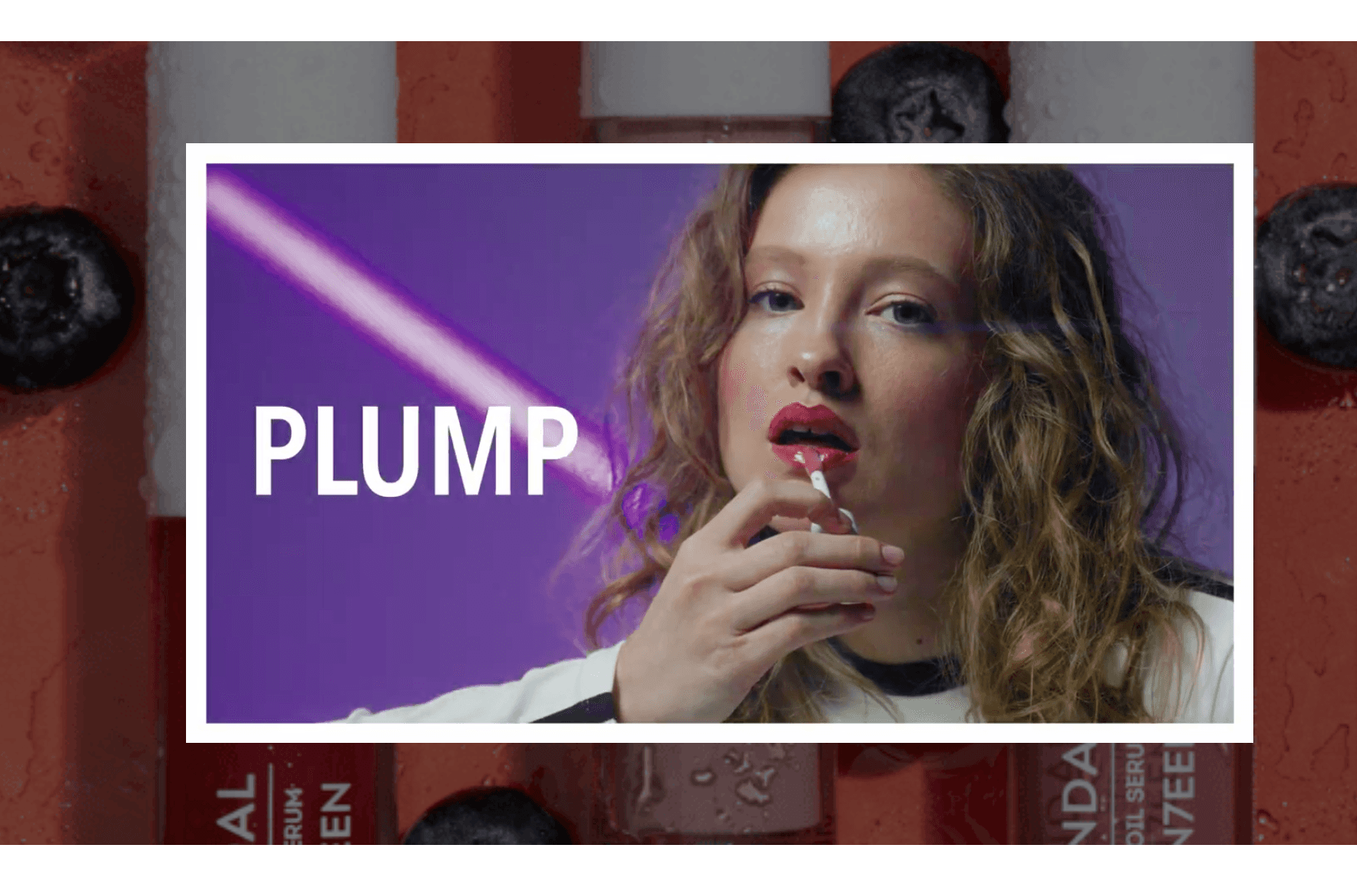
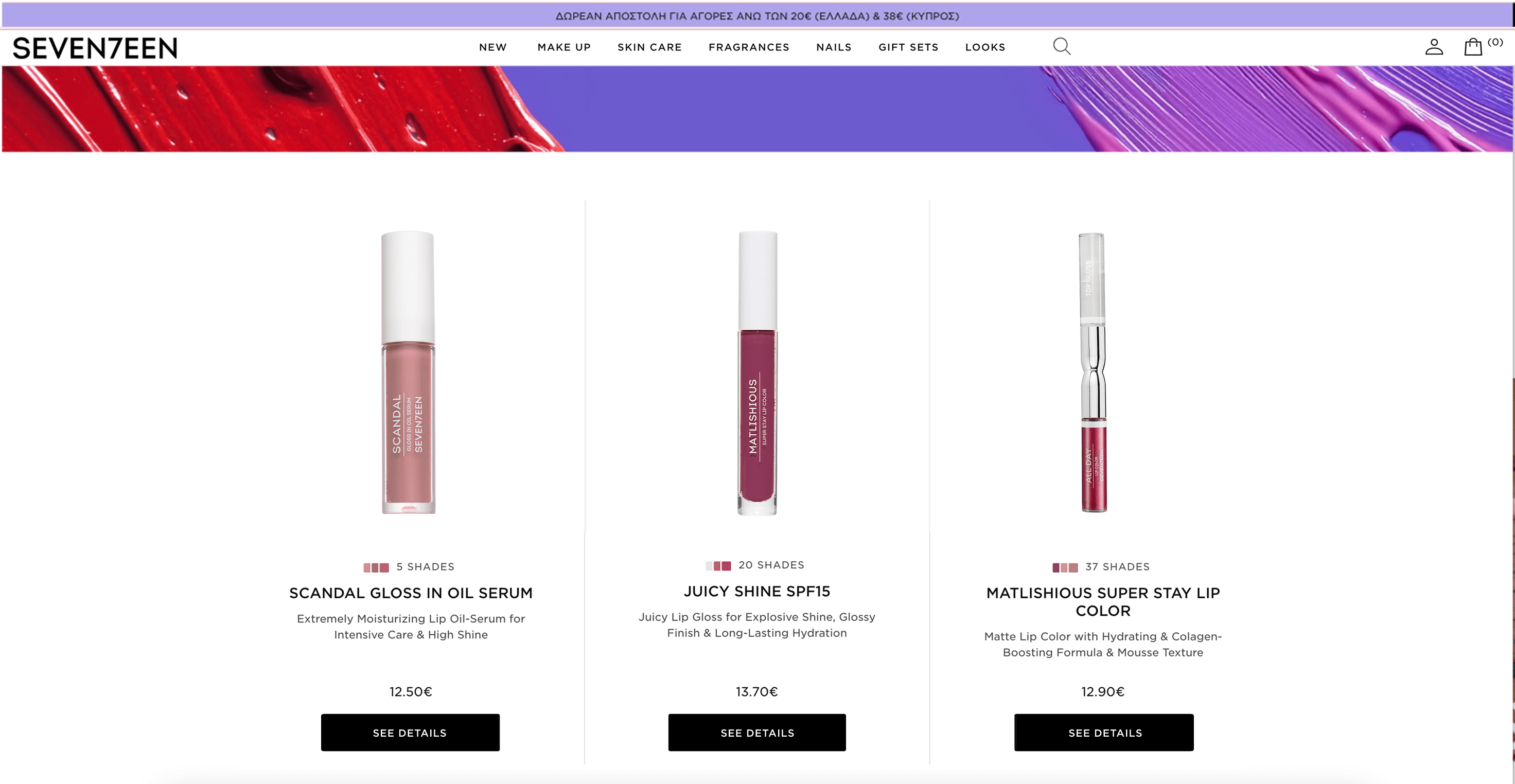
Make Up - Lips
Makeup products changed to show open products with visible applicators and swatches and a hover state revealing the product applied on a model or in a lifestyle shot. Microcopy was updated from “See Details” to “Select Shade” to set the right expectation before click.
BEFORE
AFTER

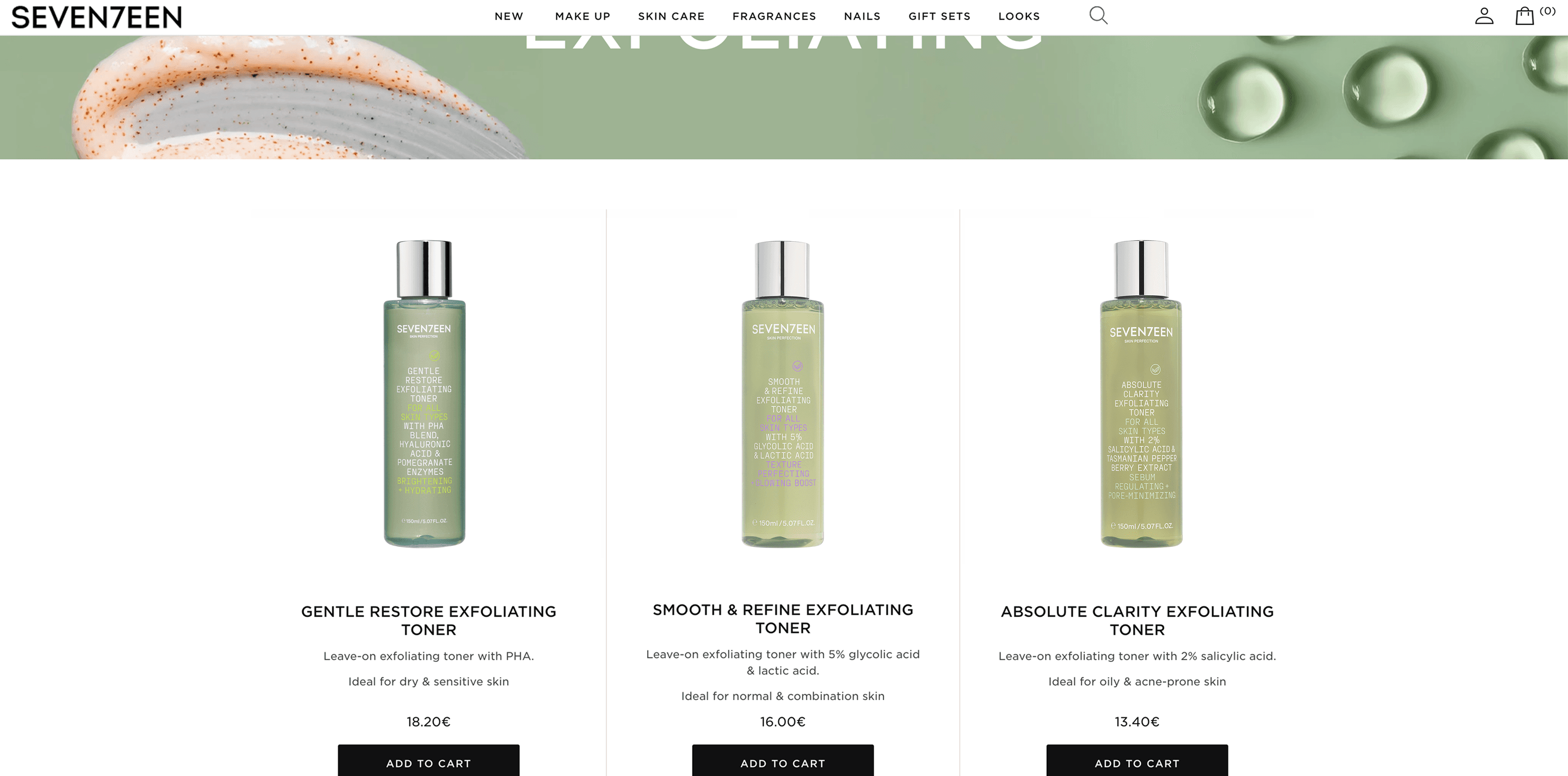
Skincare - Exfoliating
Skincare visuals changed to show a clean and consistent feel, using subtle background shades and a soft mirror effect with hover states introducing application or lifestyle imagery to add context without cluttering the grid.
BEFORE
AFTER

Fragrances - Eau De Toilette
Fragrances used GIF animations to visually express scent notes and mood, helping translate an otherwise intangible product into something more sensory and engaging.